

And no, I will not tell you what my company app is.
You must log in or register to comment.
But our power users!!
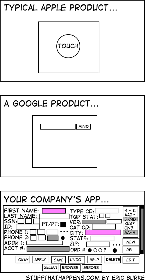
If your company is implementing an app that is basically a toggle switch or power button, it’ll probably look like the first one. If your company is implementing an internal search engine, it’ll probably look like the second one. If anybody is implementing a data entry system meant to be used by trained individuals at a workstation, its gonna look like option three. You might as well complain about a CNC mill being more complicated than a screwdriver, they’re different tools.
That third screenshot, assuming good keyboard navigation, would likely be a godsend for anyone actually using it every day for regular data entry (well, okay, not without fixes–e.g. the SSN and telephone number split apart as separate text boxes is terrible).
This same mindset is what led Tesla to replace all their driver friendly indicators and controls with a giant shiny touchscreen that is an unmitigated disaster for actual usability.
The company app is for actual work, the others are for instagram and netflix
I worked for a big Euro bank for a bit and that was exactly it. JS timeouts were forbidden, so no animation to tell you something was finished, you had to keep clicking a Refresh button to know. In 2022.
And the colleagues who had been there a few years were actually defending this shit. Stockholm Syndrome is what it is. There wasn’t a day I didn’t complain about their piece of garbage of an intranet.
I’m so glad it’s behind me.Gave me flashbacks to my time working with Philips’ Tasy system in 2017.
By now they must have finished implementing their HTML5 system which was somewhat better, but back then it was still a desktop app made almost entirely using Delphi and was basically as unsightly and unwieldy as the example in the meme lol
“We want to look like Apple” while insisting on every bit of whitespace be filled.
“If Apple can make the interface effortless, why can’t we?” asks the company spending 1/10000000th as much as Apple on R&D.
“Dunno, did you try assigning the entire task to 9 different teams, and picking the best one once they’re all finished?”
But hey, ROUNDED CORNERS! SUPER ULTRA HIGH DEFINITION ICONS! That’s what makes apple apps apple, right?
Psht, yeah I remember iPhoneOS, that came out last year, right?
We have to get permission from Marketing, the CEO, the Pope, and the ghost of Queen Elizabeth 2 to change anything about the layout, so we just jamb in more buttons.
Wrong, the google product is dead
And the Apple product would probable say “gloat about me to your friends”
And it was one they bought, just to kill it… Google: the sadist of the tech world.
Not too far off from my company. However, I work in Healthcare so we’ve got to do a lot of verification. Also, it’s more what we support for our customers rather than what users/patients should see. At least I hope.
This is not true. Literally all of apples computers lack the touch feature on their primary screens.
Everyone knows what DK9B is, we don’t need better labels.
Donkey Kong 9 Billion
Ngl I prefer said company app rather than “new” stuff which runs on Electron and breaks just from looking at it
Fuuuuuuuuck Electron
You forgot the ads on google
People at my company are like “why are we wasting screen real estate with white space?” and I imagine they see the last image is an ideal UX
Apple/Google/Other Companies way, way over-do this. Clean, modern design is one thing, but avoiding all text, making things too small to see, and being unable to tell which option is highlighted, etc, all at the expense of the actual UX is such an annoying trend and I’ll never like it.
I’m a Millennial so of course I don’t have a lawn, but get off it anyway…
We’re currently trying to convince our client, that 4 different levels “mandatory” fields in a form are about two too many.
The UI they sketched looks like shit, but they think it’s absolutely necessary.
But there was this one customer, where it was so helpful to know he’s left handed. So now this is a necessary information /s
And then the logging shows that nobody uses half the fields, but the business won’t let you remove any.
The flipside is that all of the stuff you actually use is buried five levels deep.
And the flip side of that is that the stuff you actually use is spread over 5 pages worth of scrolling and requires you to read like 100 labels until you find the text boxes you want
They’re right
For the first two you need hoops and tricks for it to do what you want, the last one has bad UX. I choose the later.
yeah. usability > UX
I would argue that the first two require you to jump through hoops for edge cases, while the last one requires you to jump through hoops for every case.
If I’m going to jump through hoops anyway I’d like some degree of control over the experience.
What control do you have in either experience?
Without knowing what the user is actually doing, that’s impossible to know. If the user has to input all those fields on a regular basis, then that one screen is the superior UX.
You’re right, but:
I beginner friendly UX is a safer bet. Besides, if a user has to manually enter all those fields (assuming it continues off screen) then that’s a job for a machine, not a human. Large data input jobs are dehumanizing.
Unless you’ve actually done the user research, you have no idea if a “beginner friendly UX is a safer bet” . It’s just a guess. Sometimes it’s a good guess. Sometimes it’s not. The correct answer is always “it depends”.
Hell, whether or not a form full of fields is or isn’t “beginner” friendly is even debatable given the world “beginner” is context-specific. Without knowing who that user is, their background, their training, and the work context, you have no way of knowing for sure. You just have a bunch of assumptions you’re making.
As for the rest, human data entry that cannot be automated is incredibly common, regardless of your personal feelings about it. If you’ve walked into a government office, healthcare setting, legal setting, etc, and had someone ask you a bunch of questions, you might be surprised to hear that the odds are very good that human was punching your answers into a computer.
There are more beginners then there are experts, so in the absence of research a beginner UI is a safer bet.
And yes, if you definite “beginner” to be someone with expert training and experience, then yes an expert UI would be better for that “beginner”. What a strange way to define “beginner” though.
There are more beginners then there are experts, so in the absence of research a beginner UI is a safer bet.
If you’re in the business of creating high quality UX, and you’re building a UI without even the most basic research–understanding your target user–you’ve already failed.
And yes, if you definite “beginner” to be someone with expert training and experience, then yes an expert UI would be better for that “beginner”. What a strange way to define “beginner” though.
If I’m building a product that’s targeting software developers, a “beginner” has a very different definition than if I’m targeting grade school children, and the UX considerations will be vastly different.
This is, like, first principles of product development stuff, here.
And you are asked to add more fields and buttons, but the interface was made in a very old version of visual studio and it breaks something every time you open it up in the editor.


